Friendly reminder: key points have been highlighted for a quick and convenient user experience!
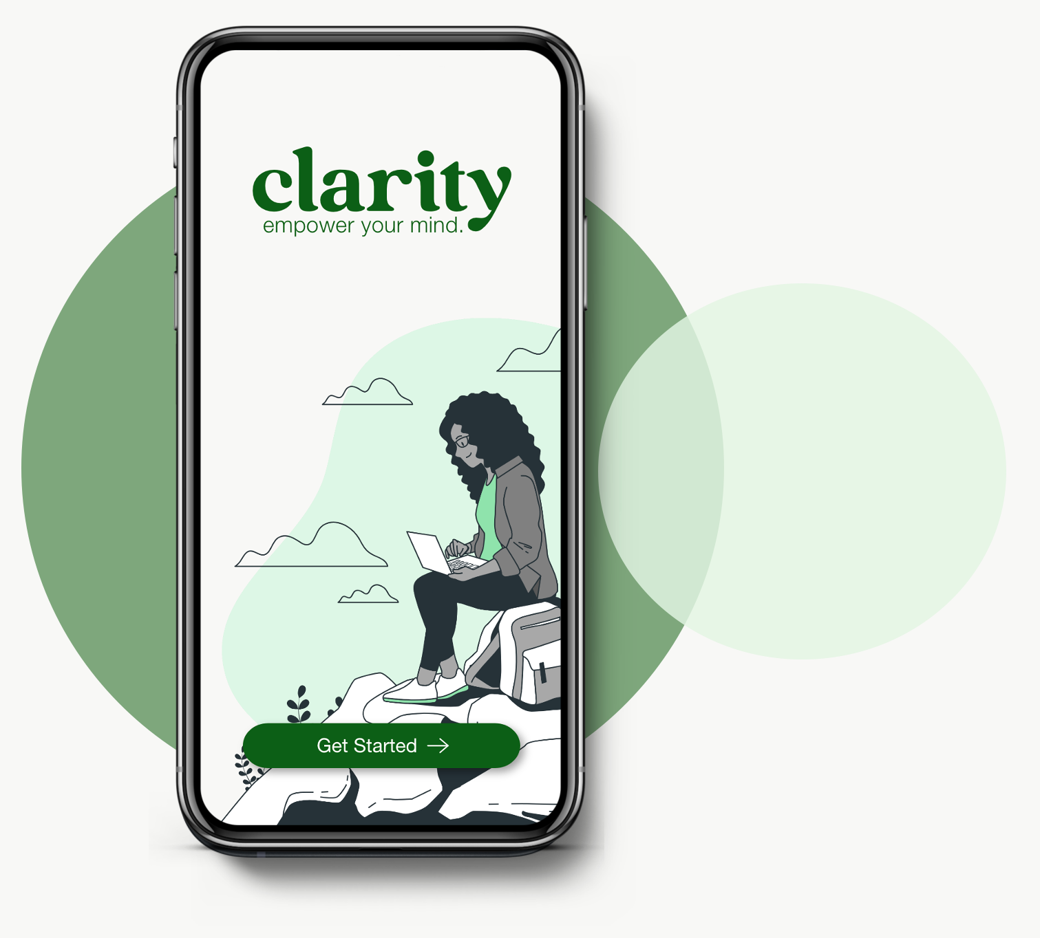
Clarity is a mobile app that provides care-seekers with mental health resources such as medical professionals, wellness articles, educational programs and helplines. Users will be able to access local providers and resources for efficient and convenient care.
QUICK SUMMARY
Let’s get started!
My challenge was to design an app that makes mental health resources more accessible for people who need them. I conducted user research to identify barriers to care such as social stigma, lack of health literacy/education, & financial concerns. Clarity aims to create a safe and judgement-free environment for users to minimize social stigma for generations to come.
CHALLENGE
ROLE
This was an individual project generated by Sharpen Design Challenge Generator. I was the sole designer throughout the design process.
METHODS
User research, competitive analysis, ideation, sketching, wireframing, prototyping, usability testing
APPROACH
I started with user research to generate an archetype and main pain points to identify user needs. The ideas were motivated by improving access and convenience of care.
Understanding the problem…
I conducted interviews and created user personas to understand the potential users and their needs. A primary user group identified through research was college students and adults who are new to the world of mental health and seeking care or wellness tips.
The user group confirmed initial assumptions that various barriers exist between them and mental health providers/resources. These barriers included social stigma, financial concerns, and health literacy/education.
USER RESEARCH
There are many pain points that contribute to a lack of access in mental health services. Three prominent issues are:
PAIN POINTS
1
Many people are in fear of social judgement for seeking mental health services, so the design should feel like a safe environment for users.
Social Stigma
2
Healthcare jargon can be intimidating and a lack of information can prevent people from seeking care.
Lack of Health Literacy
3
Financial Concern
Many care-seekers worry about the affordability of mental health services & are in need of low-cost options.
The Mental Health Novice
ARCHETYPE
“As an anxious college student, I want to know my care options to manage my stress and anxiety.”
Therapists on-campus are booked for months in advance
Goals
To efficiently find a mental health provider nearby
Wants to discover new ways to manage stress and anxiety
Frustrations
Nervous about not finding affordable resources
The mental health novice is new to the world of mental health services and needs to understand their options for care. They want an efficient way to find a mental health professional and learn about achieving mental wellness whether through educational programs, articles or helplines.
The novice needs a quick and efficient mental health resource app because they may already be dealing with high stress levels due to current life circumstances and a lack of prior care.
PROBLEM STATEMENT
WHAT’S THE NEED?
The mental health novice needs…
A jargon-free app that provides various options for mental health support and teaches them along the way.
My product will allow the novice to access several mental health services. Users can make appointments with medical professionals, access educational programs, articles and helplines. This provides the novice with direct access to care providers as well as opportunities for education to improve their current mental health status and help reduce social stigma for generations to come.
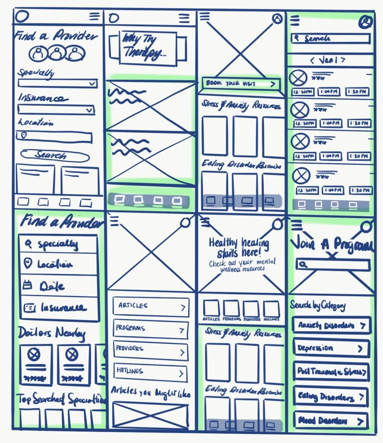
I drafted out the main frames and highlighted the features that I would like to incorporate in my app. I wanted to focus on the various care and educational options that the app offers which includes access to providers, programs, articles, and helplines.
INITIAL DESIGNS & SKETCHES
Starting the design…
DIGITAL WIREFRAMES
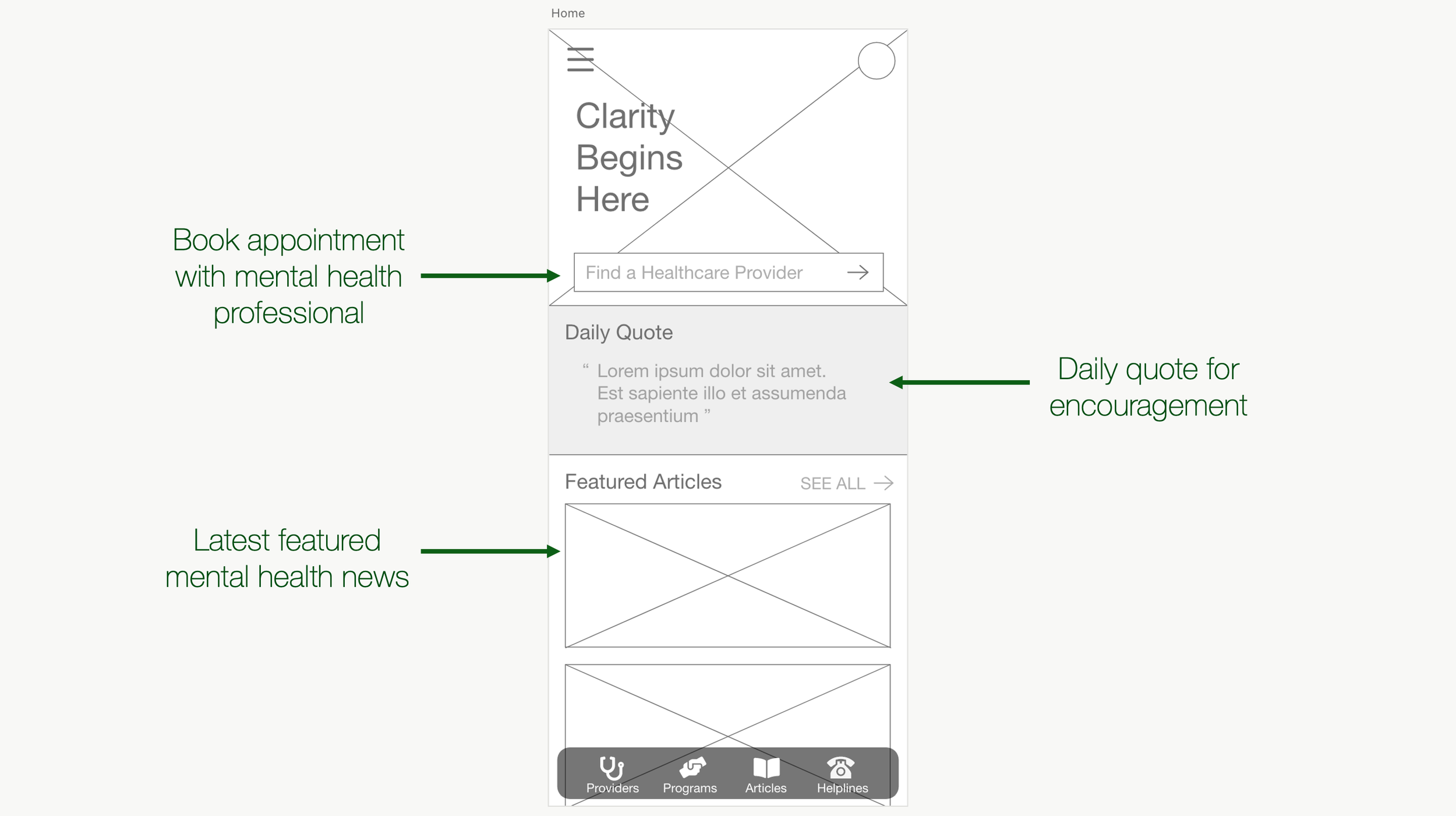
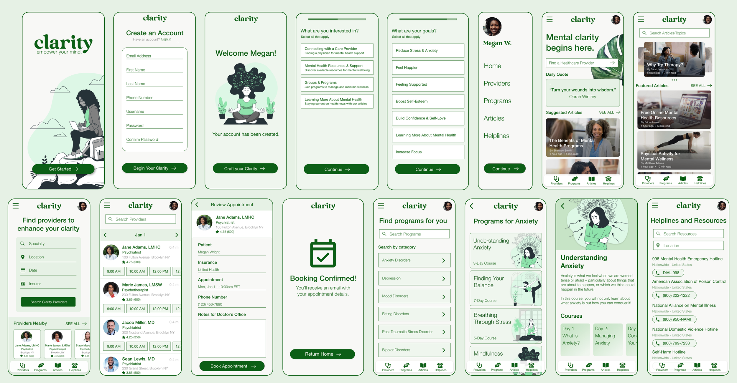
The homepage consists of three components: finding a healthcare provider, daily quotes and latest news for easy access to the app’s key features while leaving room for exploration and discovery. The homepage is accessed from the side menu.
The providers page allows users to enter details such as specialty, location, date and insurance coverage to book appointments. Additionally, the page previews local providers for users to view. The appointments page enables users to search through a list of providers that match their search inputs.
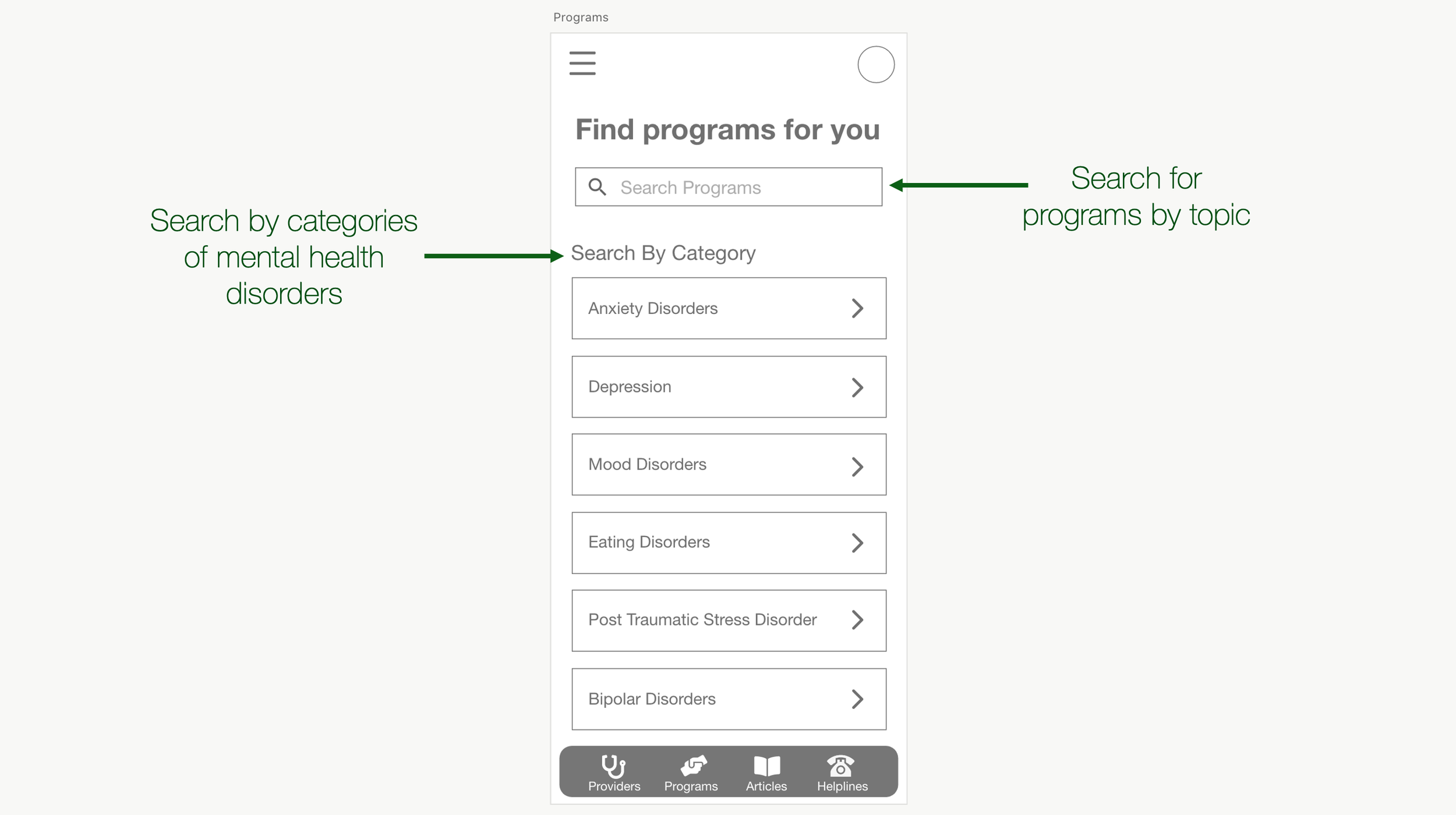
The programs page allows users to search for educational programs by category or by entering keywords and topics.
Homepage
Users can discover providers, view daily quotes, suggested articles and have easy access to all features using the bottom navigation panel.
Find Providers
Users can find providers by entering their preferred specialty, location, date and insurer. They can book an appointment and view clinician availability, ratings, address, and distance.
Programs
Users can discover educational wellness programs for specific mental health conditions. They can search by keyword or categories and enroll in courses based on their goals and interests.
Helplines & Resources
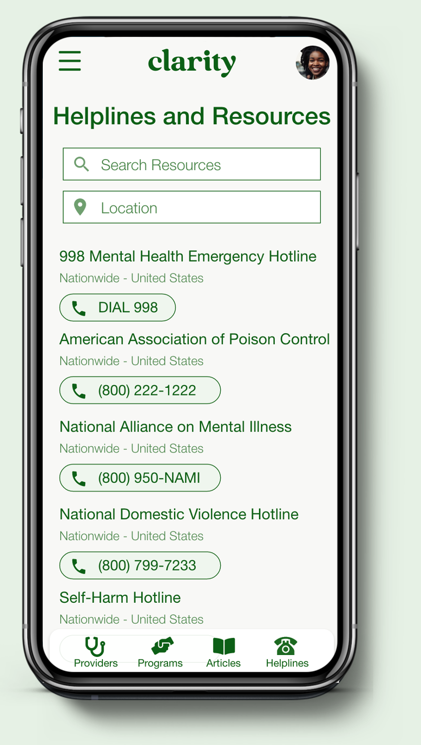
Users can search for mental health resources in their area and access nationwide helplines for more urgent matters.
Articles
Users can search for articles by title or topic. They can also view featured articles, authors and estimated read-time.
Reflection
This project allowed me to design with social considerations such as reading levels, health literacy, social stigma and overall accessibility in mind. I wanted to prioritize making the app user-friendly and comprehensive for new users.
This was essential because the goal of the project was to create a more accessible jargon-free product that welcomes learners. I was intentional about prioritizing this throughout the design process.
What did you learn from this project?
Next, I would like to add a community and accountability partner feature for users to join programs together and track their progress together. This may be a great way to reduce social stigma and increase mental health awareness even further.
What’s next?
I would have worried less about the visual design elements early on in my design process. Taking a moment to access the user flow helped me refocus on the UX of the app itself.
What would you have done differently?


